Designing for the Environment
Project Format: Semester long course project for SI 582: Interaction Design
Role: UX Designer, UX Researcher, Interaction Designer
Time Span: September 2019 - December 2019 (4 months)
Task: Design a solution to motivate recycling and provide recycling information
Design Process
Problem Statement
This class revolved around guiding students through the whole design process, all the way from need-finding to digital prototyping. We were free to decide what our project would be on and what our system would do. After walking around campus and seeing countless pieces of litter scattered through Ann Arbor’s streets, I decided this was the problem I wanted to tackle. Being from Ann Arbor, it saddened me to see people, mainly students no less, show little care towards the environment. After conducting six need-finding interviews with students who live in different types of housing, I realized that students generally are willing to recycle, but they feel unmotivated to do so if it isn’t their direct responsibility, and that students often are confused as to what is recyclable and what is not. This led me to my problem statement:
Problem: Students feeling unmotivated to properly recycle and dispose of waste when they see others not doing so, and it is unclear what is and isn’t recyclable.
Competitive Analysis
I compared five recycle-based applications that would act as both direct and indirect competitors to my tool. I analyzed their strengths and weaknesses in order to see what features may be useful for my tool, and which features may be unnecessary.
Ideation and Brainstorming
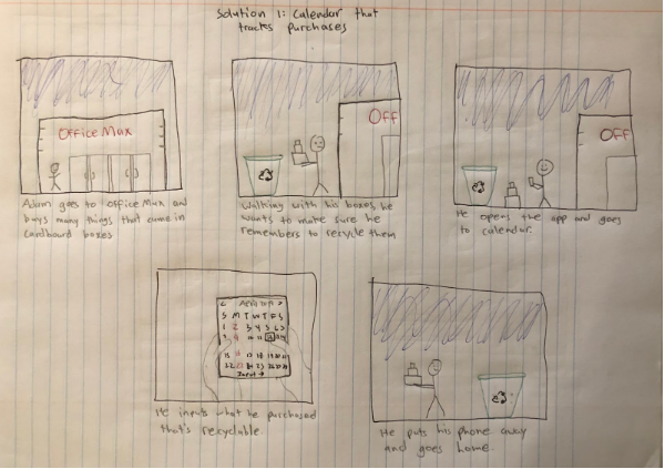
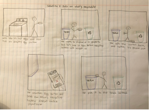
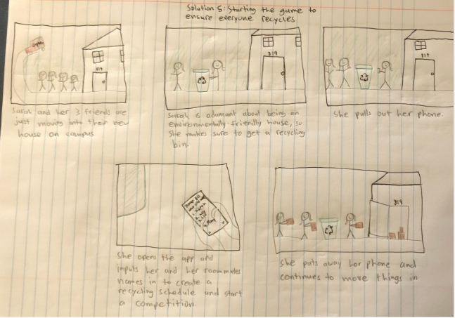
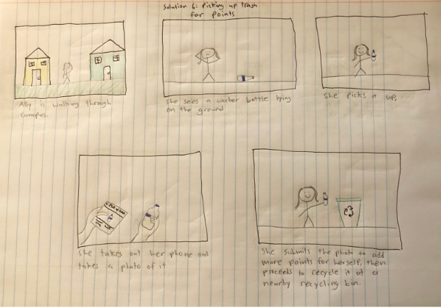
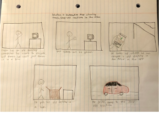
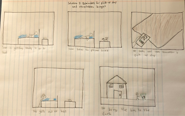
My design solution needed to cater to two needs: provide information on whether an item is recyclable or not, and motivate people to recycle/properly dispose of their and other’s waste. To offer this motivation, I decided to turn to gamification, where people would score points by recycling and picking up litter properly. To explore how this gamification process could work and other potential features of my application, I turned to paper sketching.


Personas
To provide a visual understanding my consumer base, I generated primary, secondary, and anti personas for people who live in college towns such as Ann Arbor who have some connection to the city (students, residents, etc.) and have some sort of environmental consciousness, whether it’s low or high. Using these personas and information from interviews, I was able to concentrate on my primary user group: college students and young adults who want to either improve or structure their recycling habits. The gamification aspect will appeal to a younger user group, as these are the kind of people more engaged in competitions.
Design Synthesis & Defense
I defined the critical feature of my application as the game aspect, where users compete against each other and win by recycling and disposing litter the most out of other players in their game. I used the Questions, Options, Criteria (QOC) method to visualize trade-offs between different game formats, and ultimately decide how to format the game feature.
From my QOC analysis, I made three decisions on designing my critical feature. First, I decided to allow users the option to make either public or private games so that people can make games of any size. Second, I decided to make it so users must take a photo every time they submit an item for points. This is to not only prevent cheating, but also to facilitate another feature of the application which makes a collage of all the waste that a user picks up so they can visually see the impact they have made on the environment, and if they wish, post this collage to social media. Finally, I decided to allow users to pick between having a score limit or time limit while creating a game to provide more game customization.
Paper Prototype
In order to start thinking about how users would interact with my application, I produced a low-fidelity paper prototype which allowed me to get some feedback from peers through user testing. I received quality feedback from users, with the most common comments pertaining to confusion over how the game works and what the options entail when setting up the game. I also was advised to get a user’s location data since recycling rules are different in different states. With this feedback in mind, I worked towards producing a mid-fidelity prototype.
Mid-Fidelity Prototype / Wireframe
Using Adobe XD, I designed a mid-fidelity prototype with the intention of providing more instruction in my design to guide the user. I chose a color pallette that was in tune with nature, and created a simple tree as the logo to represent the growth of environmental consciousness.
High-Fidelity Prototype
Most of the changes I made from my mid-fidelity prototype to my high-fidelity prototype were aesthetic. I cleaned up the look by removing the white boxes and making screens less wordy, thus giving a simpler look. These decisions were made based on user feedback from my mid-fidelity prototype. The video on the right gives a walk-through of the application, and some screenshots are also shown below.
Discussion
This project was valuable experience because it was the first time I went through each stage of the design process and multiple iterations of prototyping. It taught me the usefulness of pen and paper sketches and how to optimize user interactions through paper and digital prototyping.
My goal was to develop a tool that would motivate people to recycle more through gamification and providing information on recycling. However, I acknowledge that competition may not incentivize every type of user to recycle more, such as older citizens or people who live in rural environments. Further exploration could dive into how to make recycling more accessible for people who may not have the means to effectively recycle.
In terms of design and interactions, looking back, I would change a few things. First, I’d reduce the sizes of the icons in the menu bar, as the current sizes makes the menu bar look cramped. Second, in the game set-up, I’d add depth to the buttons, specifically the buttons for deciding public or private game or how the game ends, to make them more clickable. Right now, they look more like flat illustrations. Despite these reflections, I’m still proud of the work I did considering this was my first time taking on a UX project.
Explore my other projects:
IHPI Airbnb Design Jam Halcyon Consulting
arycus@umich.edu | 734.926.6961

